Friday, 23 February 2018

I've been trying to develop my ideas more for the DGA 130 Experimental Project. I thought creating rough storyboards for some of the sections would help me flesh out these ideas. Below you can see the results:


This is one of the first ideas for my project. Since I love tea, I thought having the character leaning up against a cup of tea would help to show that! The main draw of the idea is self deprecating humor, since I tend to use it on a daily basis. Simply, the character takes an sweet out of her pocket and inspects it, the writing on the object says 'Good Social Skills'. The character looks dissatisfied and throws the sweet into the tea cup behind her. The process repeats, but this time she takes a sweet out of her pocket that reads 'Social Awkwardness', she appears happy and eats the sweet.
This is a very simple idea based around a jab at my social skills, I think it's kind of funny, but I may work on it.


This is another idea I have! This one is based on my friends and family. There will be a letter on the table addressed to the character from 'Best Friend', the character looks excited and opens the envelope. Inside she finds a nice bracelet, she puts it on and looks happy. This is based on a bracelet I actually received from a friend a few weeks ago, I thought putting this simple little story into animation form would be fun as well as showing another aspect of myself.


This is the final idea I have at the moment. It's based around how I enjoy listening to music.
Once again, a simple idea, the character is sat listening to music, tapping her feet in time to the beat. She checks the music player she's holding and it shows the name of the song. When the song name displays, it'll be the name of the background music playing in the animation itself. I thought a moment in which the animation breaks the fourth wall/is self aware would be funny/interesting.
This idea still isn't too developed, so I'm hoping to develop it more in the coming weeks.


All these ideas are short, because they'll be combined together, the idea I've got is basically a compilation of things I like and enjoy.

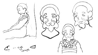
After receiving some feedback from one of my lecturers I decided to try simplifying the designs of Shen Nung and his Assistant once again. Below you can see the results:


In comparison to the previous iterations of these designs, not a lot has changed. I removed a few elements from both the designs, for Shen Nung, I removed a lot of the leaves he wears around his neck and changed the style of his beard. I also removed his extra layer on his robe, although it looked nice, it would have been quite difficult to animate and draw from certain view points. For the Assistant, I didn't change much at all, I simply removed the extra layer underneath her robe.

By changing these details, I hope we'll have an easier time animating these characters.


Monday, 19 February 2018

For another one of our modules: DGA 130, we have been asked to create a piece of experimental animation that is a 'self portrait'. I've been trying to decide on an idea for some time now, and now I've managed to decide on one.

My idea will be very simple, it will be a series of short animations about things I enjoy or just general information about me. For example, one could be about tea, or how I enjoy drawing, or how I love my friends and family. There will not be any real narrative, since the project is experimental.

I decided to try drawing up some designs for a simplified version of myself. Below you can see the results:


As you can see, the designs are fairly simple, as I did not want to focus on a detailed style. I also think this style will be easier to animate in.

Currently, I am trying to choose between the top two designs, there's only a small difference, one design has acne on the face and the other does not. On one hand, I think adding the acne makes it look more like me! However, I'd have to make sure I keep the acne looking consistent on the design throughout the animation. Also, other people may not find it appealing to look at.

After receiving positive feedback on my new designs, I was asked to try drawing model sheets for the two characters. Below you can see the results:


I tried to do as many views as possible, so it would be easier to draw the characters from different angles. I also included colour palettes so we could easily grab the colours when animating/drawing them!

After talking with my group more, they decided they wanted to try a more traditional Chinese art style for the characters. So I tried my best to redraw the designs I'd come up with in this newer style. Below you can see the results:


I actually found this quite difficult to do, since this style of drawing is so drastically different to my own art style, which is more cartoony. I used a lot of reference images that I found through research on google. I'm sure you can agree that these new designs don't quite look the same as the traditional Chinese style of drawing, but I tried simplifying it a little, so it would be easier to draw/animate in the future.
After drawing up the sheets for Shen Nung and his Assistant, my group suggested that I try drawing them a bit more, just so I could get used to drawing them in the style we'd picked. Below you can see the results:


Although they're fairly simple doodles, I felt that doing these drawings helped me get a better feel for the two characters, it allowed me to draw a few more poses and emotions.
After receiving some more feedback from my group on the designs for Shen Nung and his Assistant, I decided to try drawing up some coloured reference sheets for them! Below you can see the results:


We decided on more saturated colour schemes for these two, because we thought it would work well against the traditional style backgrounds we'll be using. They'd fit within thew environment, but still stand out against the backdrop.

I'm fairly happy with how these turned out! 

Saturday, 10 February 2018


Whilst waiting for feedback on some of my Shen Nung designs, I drew up some designs for his assistant. The only thing specified so far is that the assistant is female. So I decided to try searching for historical representations of Emperor's assistants in order to aid my design process.

Below you can see the results so far:


I stuck with a fairly simple design, since she's only supposed to be an assistant and probably wouldn't wear fancy clothing. I also played with hairstyles and couldn't really decide whether it should be short or long!

I haven't received any feedback on her from the rest of my group yet, so for now she'll stay as she is. 

The next stage of design for Shen Nung was costume design. 
Below you can see some concepts I've made:


I tried out a few different colour schemes just to see what would work best with the background concepts we had (Although we haven't decided on a proper colour scheme for him yet!)

Similar to the basic designs, I decided to look up how Shen Nung was represented in other paintings etc, and base his outfits off of those. In the majority of the images I found, his outfits were fairly similar. So there isn't too much variety in his outfits here.

After receiving some feedback from my group, I decided to try coming up with another outfit design for him. This is because my group didn't think my designs looked quite regal enough for him to be recognized as an Emperor. I agree with this! I think his designs look a little too modest.


Since I've been assigned the role of concept designer, I wanted to try drawing up some character designs as well. The two characters for this section are the Chinese Emperor Shen Nung and his assistant. I started with Shen Nung, since the section mostly focuses on him. 

Below you can see my concepts for Shen Nung's design:


After researching Shen Nung as a group we found he was represented in a few different ways, but all of them shared one thing: that he was an Emperor. Independently, I decided to research how Shen Nung had been represented and based my designs off of those.

After some feedback from my group, I think we're choosing design number 4, as this is closest to how he's represented in traditional paintings and tellings of the myths he's a part of.


After receiving feedback on my previous backgrounds, I decided to use a more muted colour scheme. As a group, we decided that a more muted/subtle colour scheme would suit the style better. It would also make the characters stand out a lot more.

Below you can see my next set of background concepts:


As you can see, the layout is fairly similar to the previous set of backgrounds I made. However, I tried changing up the style more, so it would look more like a Chinese scroll drawing. I decided using a tan background/sky would make it look more 'authentic' as well.
I'm not too happy with how the leaves on the trees look, I don't think they suit the style that well. I may redo those in the near future.


This week during a group project meeting, we were all assigned roles. After being assigned roles, we went to go and work on what we were individually assigned. We used a Facebook Messenger group chat to keep in contact with each other and share our progress!
This method of communication works well, as we are able to work on our work independently but still receive feedback from each other. 

I was assigned the role of concept design for one of the sections of our animation. So during this week, I drew up some concepts for backgrounds and character designs for that one section.

Below you can see some concept backgrounds I drew up. This particular section of animation is set in ancient China, so we wanted to try and make the designs fit. At first, we weren't quite sure what style we wanted, so I just tested colours and brushes out.


These were the first backgrounds I tried out. I thought a fairly simple style would be best, since the focus should be mostly on the characters. I took colours from old Chinese paintings and scrolls to create the colour palette used. However, I couldn't decide whether lined art or flat colour art would look better, hence the two different variations. I also used a crumpled paper texture to make the background feel more like an older piece of art, or a storybook.

Friday, 2 February 2018

For one of our new modules, DGA 140, we’ve been placed in groups and asked to come up with an idea for a short animation based around the idea of tea. Before we decide on an idea as a whole group, we’ve been asked to come up with individual ideas to present.

My idea is based off a myth of Chinese origin.
Here’s a short summary of the myth-

- Takes place on Mount Ying T’ang
- Monks lived on the mountain and farmed
- Monkeys would come to the mountain and steal the Monks’ crops/harvest
- One year, the Monks decide just to share their harvest with the Monkeys
- The following spring, the Monkeys returned with bags full of tea leaves to share with the Monks.
- These leaves grew in higher trees and could not be reached by the Monks!
- This new tea was then called ‘Monkey Tea’

This legend seems fairly simple and easily adapted to an animation.
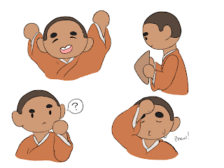
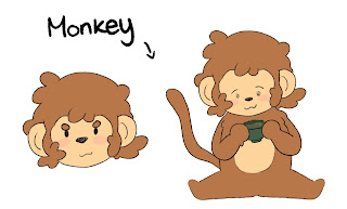
I drew up some potential designs for the Monk and Monkey characters, you can see them below:


I decided to use quite a simple style, because my target audience is a wide range of people, from older people to families. The simple style would also be a lot easier to keep consistent within an animation!